Pie charts are an incredibly useful tool when you want to highlight the differences between certain data points. However, though great, they aren’t exactly precise – it’s hard to discern an accurate number from the angle of a particular section. In this article we’re going to show you how to create a pie chart in Excel with labels so that you can have the best of both worlds.
There Are Different Ways to Create a Pie Chart in Excel
We’ll first look at creating a basic Excel pie chart, then move on to adding labels, customizing its visuals, exploding the pie chart, and finally creating a pie chart with a bar chart to the side.
Before you put the time in to make a pie chart in Excel, do bear in mind that you can only display a single data series in one and are unable to use zero or negative values. If your data set doesn’t fit those requirements, you may be better served by our bar chart tutorial, which is linked at the bottom of the page.
How to Make a Quick Pie Chart in Excel
Creating a quick pie chart in Excel is a straightforward process designed for users who need to visualize their data in a pie format rapidly. This method is ideal for presenting a clear and immediate comparison of parts to a whole, making it perfect for summarizing data distributions across different categories in a visually appealing and easily understandable manner.
-
Select Your Data
Begin by highlighting the data range you want to represent in your pie chart. -
Insert Pie Chart
Navigate to the “Insert” tab on the Excel ribbon and click on the pie chart icon. Choose the “2-D Pie” option for a basic pie chart or select “3-D Pie” for a three-dimensional look.

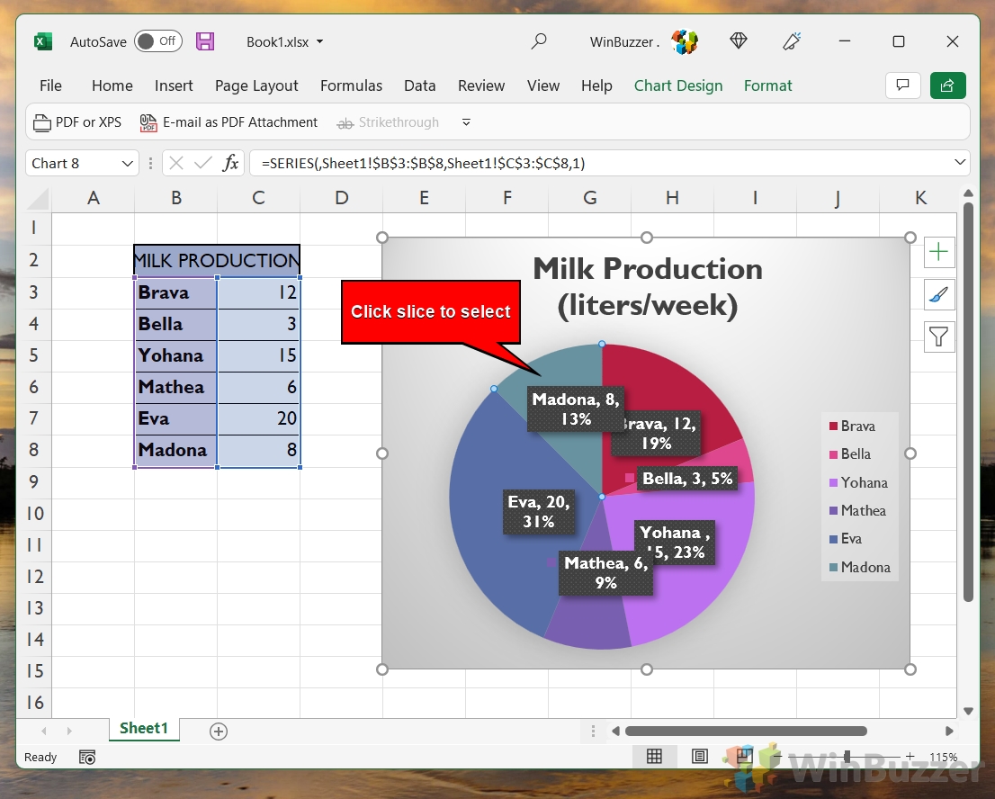
How to Label a Pie Chart in Excel
Labeling a pie chart in Excel involves adding descriptive text to each slice of the pie, providing clarity and context to the data being represented. This step is crucial for making your pie chart more informative and accessible, as it allows viewers to quickly identify what each slice represents without referring back to the data table.
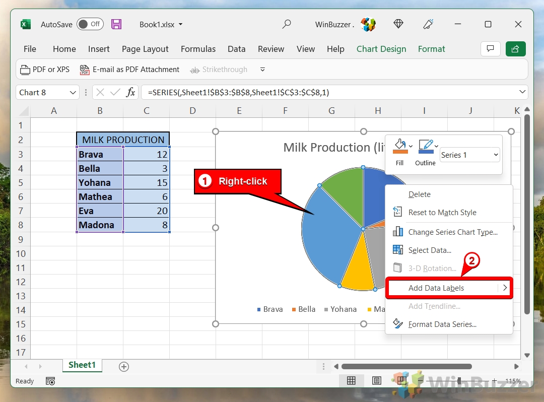
- Right-Click Your Graph and Choose “Add Data Labels”
This action will automatically place labels on each segment of your pie chart, displaying the data values.
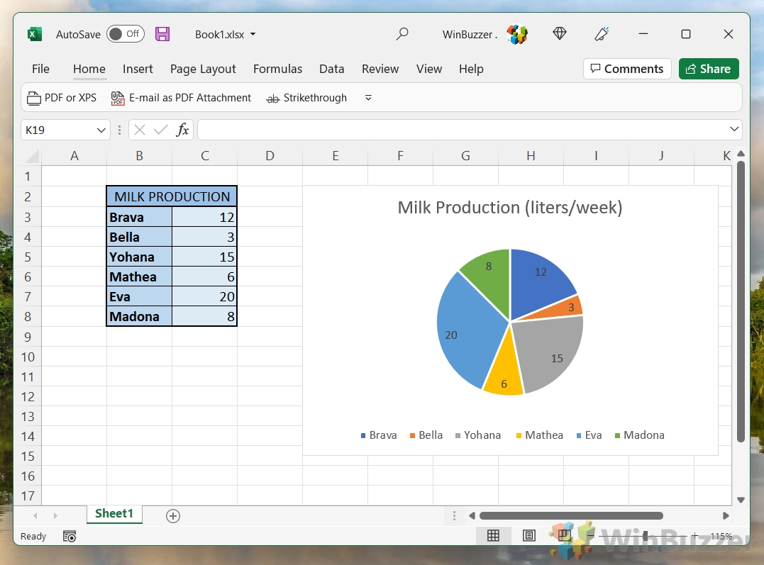
- View Automatic Data on Pie Segments
Once you’ve added the data labels, they will appear on the chart, directly on the corresponding segments.
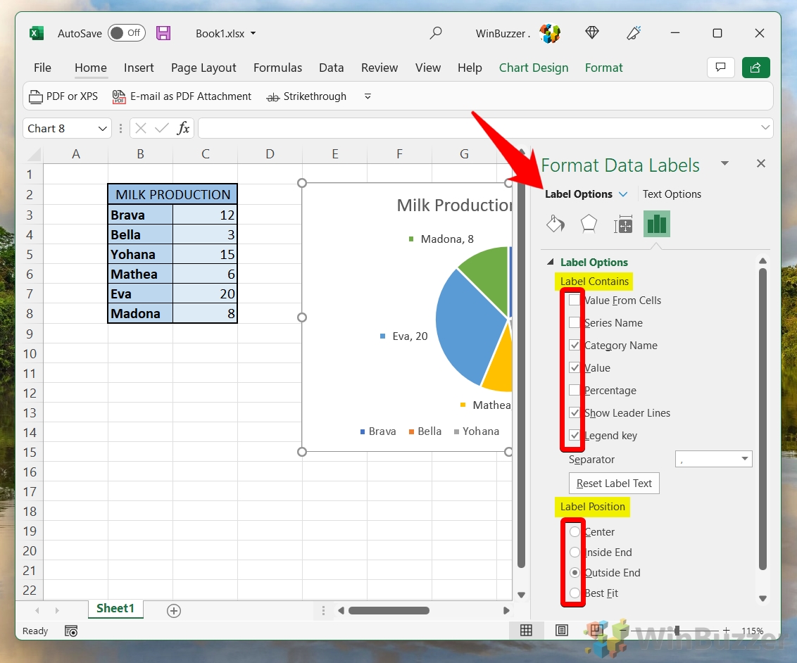
- Customize Labels by Right-Clicking Graph and Selecting “Format Data Labels…”
For more detailed customization of your data labels, right-click on the pie chart again and select “Format Data Labels“. Here, you can choose what information to include in your labels and where they should be positioned.

- Select Label Contents and Positioning
In the “Format Data Labels” menu, you can select options such as displaying the percentage value, category name, or the actual data value. You can also decide where on the chart these labels should appear.
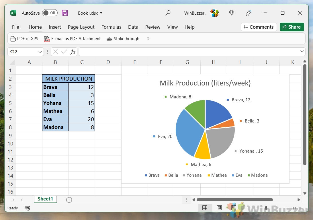
- Preview Changes and Close Formatting Window
After customizing your data labels, review the changes to ensure they meet your needs. Close the formatting window to apply these changes to your chart.
How to Customize a Pie Chart in Excel
The default design of pie charts in Excel is very plain and often uses colors that aren’t visually appealing. Customizing a pie chart in Excel allows you to tailor the chart’s appearance to better suit your presentation needs or personal preferences. This method covers various aspects of customization, including changing color schemes, adjusting font styles, and applying different chart styles, enhancing the visual appeal and effectiveness of your data representation.
- Choose Style from “Chart Design” Tab
Select your pie chart to activate the “Chart Design” tab, where you can choose from various styles and color schemes. You’ll find various styles above the “Chart Styles” heading which will give your chart a fresh look.

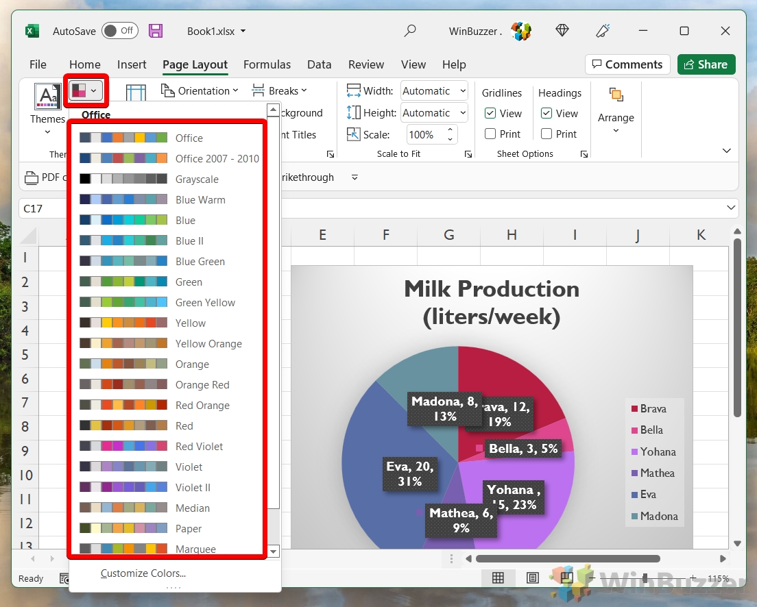
- Select Color Palette Presets
For more color customization, click “Change Colors” in the “Chart Design” tab and select a color scheme that fits your preference.

- OR: Apply Themes from “Page Layout” Tab
If you want to apply a more comprehensive theme to your document, including your pie chart, go to the “Page Layout” tab and select “Themes“. Bear in mind that this will change the settings across your entire document, rather than just this particular graph.
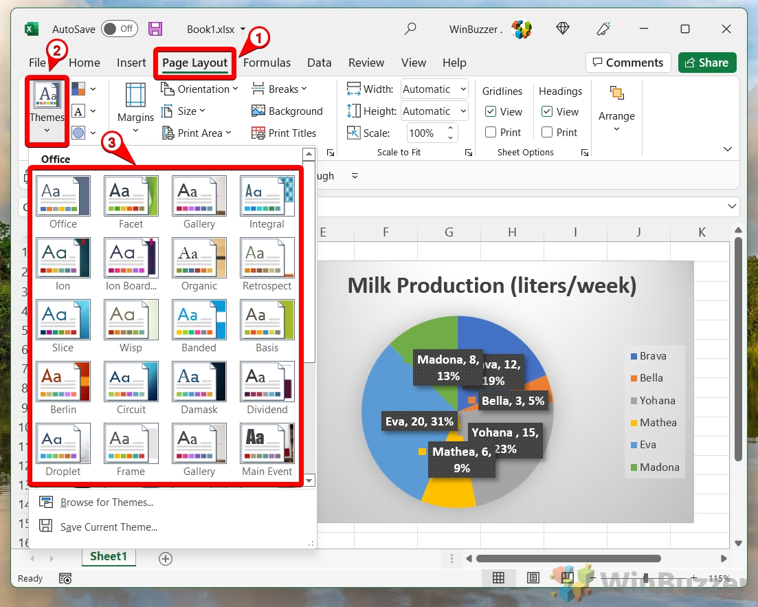
- Adjust Chart Colors via Themes Button
To fine-tune the colors of your chart elements, click the small grid icon next to the “Themes” button in the “Page Layout” tab.
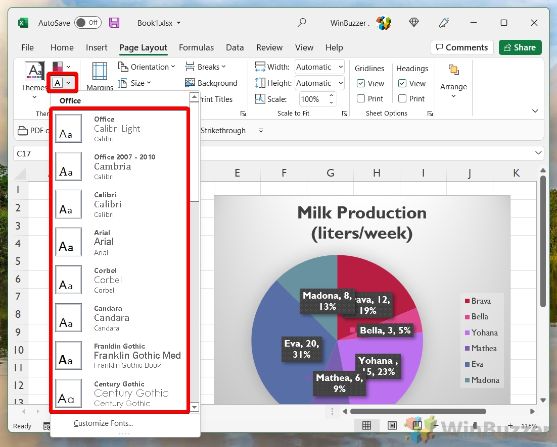
- Change Font Using Text Icon
To modify the font used in your chart, click the text icon in the “Page Layout” tab and select your desired font.
- Select Shading Type for Elements
For additional visual effects, click the shape icon in the “Page Layout” tab and select a shading option for your chart elements.

How to Explode a Pie Chart in Excel
Exploding a pie chart in Excel refers to the technique of separating one or more slices from the rest of the pie, creating a visual emphasis on specific data points. This method is particularly useful for highlighting significant parts of the data or drawing attention to particular categories that require more focus.
- Select Chart
First, click on your pie chart to select the entire chart.

- Drag Slice to Side
To explode a segment, click on a specific slice and drag it away from the center of the chart. This will separate the slice from the rest of the pie.
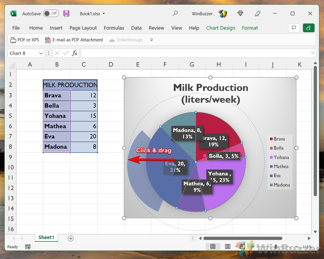
- Release Mouse to Apply Changes
Once you’ve positioned the slice where you want it, release the mouse button to set the slice in its new position.

- OR: Select Single Slice
If you prefer to explode only one slice, simply click on that slice to select it.
- Move Slice Individually
After selecting a slice, drag it outward to explode it from the pie chart, emphasizing that particular data point. You can repeat the process for each slice in your pie or leave it as-is if you want to highlight a particular result.

How to Create a Pie of Pie Chart
Creating a Pie of Pie chart in Excel is a specialized approach used when you have a set of smaller data points that are difficult to distinguish in a standard pie chart. This method involves generating a secondary pie chart from one or more slices of the primary pie chart, providing a clearer view of the smaller categories by giving them their own separate space for detailed analysis.
- Insert Pie of Pie Chart
Select your data, go to the “Insert” tab, and click the pie chart icon. Choose the “Pie of Pie” chart option, which is designed to highlight and break down one of the smaller segments of your main pie chart into a secondary pie chart.

- Format Data Series for Pie of Pie
Right-click on the newly created Pie of Pie chart and select “Format Data Series“. This will allow you to customize which data points are displayed in the secondary pie chart and how they are presented.

- Choose Data Split Options
In the “Format Data Series” pane, navigate to the “Series Options” tab. Here, you can decide how you want to split the data between the main pie chart and the secondary pie chart. Options typically include splitting by value, percentage, or custom criteria.

- Finalize and Close Data Series Window
Review your settings to ensure the secondary pie chart accurately represents the data segment you wish to highlight. Once satisfied, close the “Format Data Series” window to apply your changes.

How to Create a Bar of Pie Chart
Creating a Bar of Pie chart in Excel is an innovative method that combines the pie chart with a bar chart to represent a dataset. This approach is particularly useful for datasets where smaller slices in the pie chart are hard to differentiate. By displaying these smaller slices as individual bars adjacent to the pie chart, the Bar of Pie chart offers an alternative, clearer representation, making it easier to compare the minor categories against each other.
- Select Data and Insert Bar of Pie Chart
Highlight your data set, navigate to the “Insert” tab, and click the pie chart icon. From the dropdown, select the “Bar of Pie” chart option. This will create a pie chart with a separate bar chart for the smaller segments.

- Automatically Split Smallest Sections into Bar Chart
Excel will automatically determine the smallest segments of your pie chart and display them as a bar chart adjacent to the pie chart. This helps in making those smaller segments more distinguishable and easier to analyze.

FAQ – Frequently Asked Questions About Pie Charts in Excel
Why won’t Excel make a graph?
Excel may not create a graph if the data is improperly organized, contains incompatible values (like mixing text with numerical data in a value range), or if there are empty cells within the data range. Ensure your data is structured in a clear, tabular format with consistent data types in each column. If you’re trying to create a pie chart, remember that it requires a single series of data; multiple data series are better represented by other chart types like bar or line charts.
How do I make a pie chart in Excel without percentages?
After creating your pie chart, right-click on any data label and select “Format Data Labels.” In the formatting options pane, you can choose to display category names, values, or both, instead of percentages. This allows you to tailor the information displayed according to your needs, making your chart more informative for your audience.
Can you make a pie chart in Excel with words?
Yes, you can use words as labels for the categories in your pie chart. When organizing your data, include one column for the category names (words) and another for the corresponding values. When you create the pie chart, Excel will automatically use the text from your categories column as labels for each slice of the pie, making it easier to identify each segment.
How do I create a chart in Excel with multiple data?
To create a chart with multiple sets of data, organize your data in columns or rows on your worksheet. Select the entire data set you wish to include in the chart, including any headers that label the data series. Then, go to the “Insert” tab and choose the chart type that best represents your data. For complex datasets, consider using a combination chart or separate charts for each data series for clarity.
Why is my pie chart only showing one value or appearing blank?
This issue often arises when Excel does not recognize the data range correctly or when all but one of the values are zero, leading to a single slice pie chart. Ensure that your data range includes both the category names and their corresponding values. Also, check for zero or negative values, as pie charts cannot represent these. If your dataset includes such values, consider using a different chart type.
How do I make a pie chart update automatically in Excel?
To make your pie chart update automatically with changes in data, convert your data range into an Excel table by selecting your data and pressing Ctrl + T. This creates a dynamic range that automatically expands or contracts with your data changes. Any chart based on this table will also update automatically to reflect the changes.
Can a pie chart be 100%?
A pie chart inherently represents 100% of a whole, divided into categorical slices that sum up to the total. Each slice’s size is proportional to its percentage of the whole, ensuring that the entire pie always represents the complete dataset. This makes pie charts ideal for showing the distribution or proportion of categories within a whole.
How do you make a pie chart on your phone?
To create a pie chart on your phone using the Excel app, open your spreadsheet and select the data range for your chart. Tap the Insert option (which might appear as a “+” icon), then select Charts, and choose Pie. You can then customize your pie chart by tapping on it and using the formatting options available in the app.
How do I add percentages to an Excel chart?
Right-click on any data label in your pie chart and select “Format Data Labels.” In the formatting pane, check the “Percentage” option under the “Label Options” section. This will display each slice’s value as a percentage of the total, providing a clear view of each category’s proportion in the whole.
Is a pie chart always in percentage?
Pie charts are typically represented in percentages as they are designed to show the relative proportions of multiple categories within a whole. However, you can choose to display the actual values or category names instead of or alongside the percentages by formatting the data labels.
How do I make a pie chart in Google Sheets without percentage?
In Google Sheets, after creating your pie chart, click on it to select it, then click on the three dots in the top right corner of the chart and select “Edit chart.” In the “Customize” tab of the Chart editor, scroll down to “Pie chart” and find the “Slice label” dropdown. Here, you can choose to display “Name,” “Value,” or “None” instead of “Percentage.”
Can you make a pie chart without percentages?
Yes, you can format a pie chart to display data labels with category names or values instead of percentages. Right-click on the chart, choose “Add Data Labels” and then “Format Data Labels.” From there, you can select the type of information you want to display on each slice.
Why isn’t my pie chart showing up?
If your pie chart isn’t displaying, check to ensure that your data range is correctly selected and formatted without empty rows or columns in between. Also, verify that your data does not contain non-numeric values in the value column, as this can prevent Excel from generating the chart.
How do you sort a pie chart from largest to smallest in Sheets?
To sort slices in a Google Sheets pie chart, you’ll need to sort your data range manually before creating the chart. Select your data, go to the “Data” menu, and choose “Sort range.” Sort by the column containing your values, either in ascending or descending order, to reflect this order in your pie chart.
Can you create pie and line charts in Google Sheets?
Yes, Google Sheets supports creating both pie and line charts. Select the data range for your chart, go to the “Insert” menu, and choose “Chart.” In the Chart editor panel, select “Chart type” and choose either “Pie chart” for a pie chart or various “Line” options for a line chart. You can customize your chart further using the options in the Chart editor.
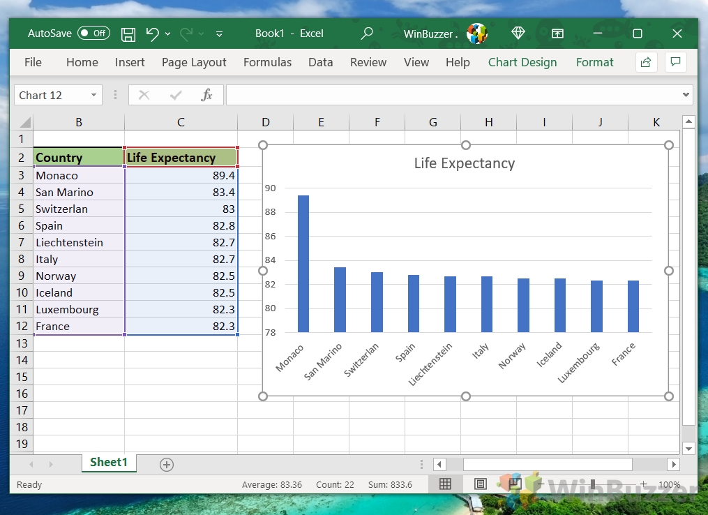
Related: How to Make a Bar Graph in Excel
If you realized that a pie chart doesn’t really work with your data set, chances are you can’t go wrong with a trusty bar graph. We even have a dedicated bar graph in Excel guide to help you make one.
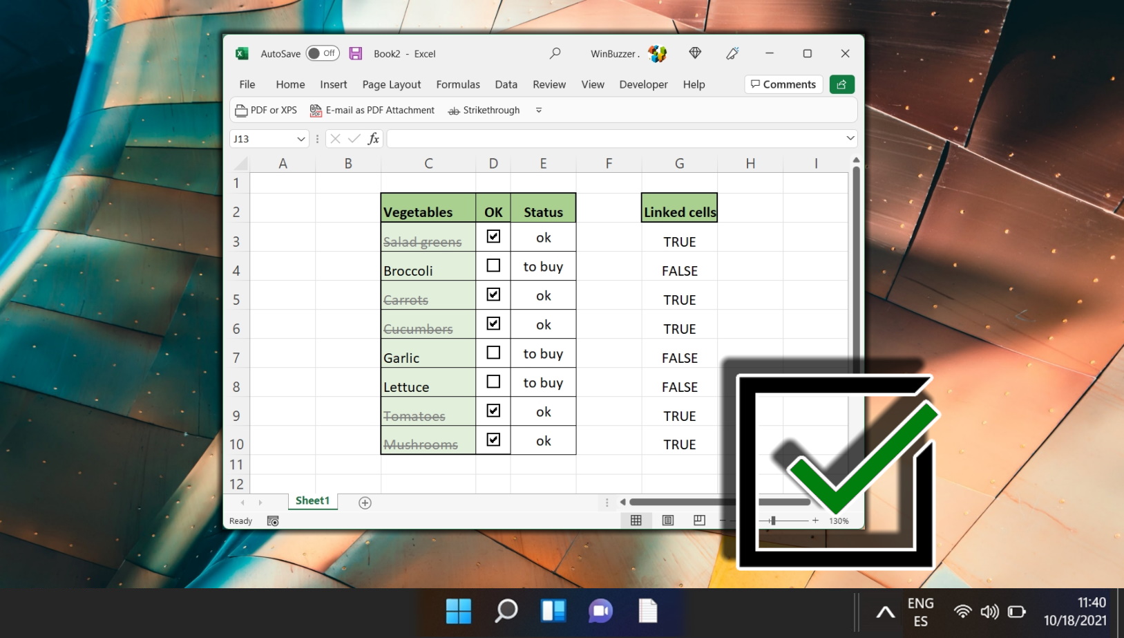
Related: How to Insert a Checkbox in Excel
A checkbox is a simple control that I’m sure everybody will have encountered online, often as part of a cookie dialog or where you’ll tell a site to remember you being logged in. Checkboxes in Excel are much the same thing, but you may not be aware of how useful they can be. In our other guide, we show you how to add check boxes in Excel, demonstrate how they function as part of a spreadsheet, and show how they can be used to build a To-Do list.
Related: How to Find Duplicates in Excel Data and Remove Them
If you noticed that you’ve entered the same data multiple times after creating your pie chart (a common mistake) you can try some of the formulas in our how to find duplicates in Excel guide. They should get rid of them and save you a lot of manual deletion.

Last Updated on April 22, 2024 10:14 am CEST by Markus Kasanmascheff