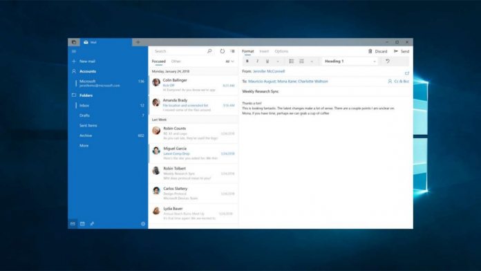
At Build this year, Microsoft announced a series of sweeping changes to Fluent UI. A series of app and OS updates will enable better depth in apps, inline flyout menus and, importantly, compact modes.
The changes came first to OneNote, but we’re already seeing additions in the Windows 10 Mail app. Microsoft is ensuring you see far more emails on your screen at the same time.
This was a particular issue for screens with a low resolution, as blown up UI elements took up a lot of space. According to Microsoft, the Fluent Design changes add 26% more emails in multi-line mode and a huge 84% in single-line.
With this change, it fixes one of my biggest criticisms with the app, allowing almost double the number of emails without having to scroll. If you haven’t yet realised, you can switch between expanded and compact mode by pulling across the inbox portion of the UI.
The Future of Fluent Design in Mail
With these features, Microsoft shows that it’s listening to user feedback, but it’s likely it won’t stop there. Mail would definitely benefit from Fluent Design’s inline menus, allowing for easy formatting and image insertion without the need for a dedicated top bar.
We’ve also seen Mail’s implementation in the upcoming Windows 10 Sets, which will let users group relevant apps in a tab-like interface. We should also the new, unified back buttion, modified menu structures, and possibly spatial audio.
If they are implemented, these features will roll out slowly as to not shock users with a sudden change. However, the compact additions will be rolling out to users as we speak, so be sure to check the Microsoft Store for updates.


