Microsoft discussed last month its plans to give OneDrive web an aesthetic overhaul. The company promised a cleaner and more efficient UI for the cloud storage solution. Yesterday, the OneDrive team discussed some of the finer details of the change.
With the new UI, users can see files and folders more easily and can now see which are new. Shared content and who has accessed content can also be seen. All of these tasks can be completed with one click through the new People Card.
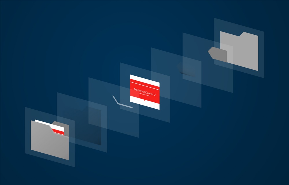
Microsoft says it has used screen space to declutter OneDrive. The new UI makes it easier to find shared files, while thumbnails are larger. It is worth noting that the changes will be universal across devices using OneDrive for web.
One of the core file experiences of the new UI is the ability to preview files without opening them. Also, finding files is now much easier and the People Contact Card now supports important meta and insight data.
Below are the new abilities Microsoft is adding:
“Find your files faster with the new design for files & folders: The new layout uses your screen space more efficiently, and the uncluttered text styles make it easier to scan across file names and notice essential information quicker. New files jump out at you. Shared files are now easier to spot, and we’ve made thumbnails larger and more detailed. Why? Because OneDrive and SharePoint are alive, active and ever-changing. New files come in, others change, some get shared out. We heard from you that these changes needed to be more apparent, and we combined that knowledge with research about how the human eye parses items. The human eye is attuned to recognize familiar shapes and colors instantly. To take advantage of this, we modified the look of the files and folders in the list and tile views so it’s easier to find what you’re looking for.
Cohesive theme and design across apps: Familiarity builds trust. As you move between devices from one moment to the next, thoughtful design decisions help remove friction and accelerate your day. To that end, we’re refreshing the files experience across Android, iOS, Universal Windows Platform (UWP) and the web interfaces in OneDrive and SharePoint. Our bright and legible color palette is more harmonious with the Office 365 suite apps you rely on. So, whatever your working style, your content always feels right at home.
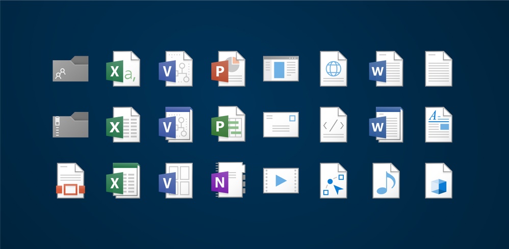
Preview files without opening them: When you store files in OneDrive, you can count on our rich viewer support for over 270 file types: Visio, Adobe formats like Photoshop, PDF and Illustrator, RAW, 3D and high-precision DICOM medical imagery to name just a few. Our preview-generation engine creates crisp thumbnails and large previews with incredible speed, and they look especially gorgeous on 4K and Hi-DPI displays like the Microsoft Surface Pro. These previews will make you more productive and find your files faster when you’re using OneDrive.
New list flexibility and compact mode: We know efficiency matters to you, and sometimes it’s the smallest details that can give you an edge. One of the frequent asks from some of our power users was a “high density list view” resembling Windows File Explorer. Today we’re announcing a new compact list that packs more items into folder views across OneDrive and document libraries with an even more uncluttered layout, so you can handle thousands of items with ease.

Stay informed on what’s popular: The cloud-powered Office graph gives you insight into how your contributions make an impact across your organization. Popular files show a trending indicator, so you no longer have to dig around to see what’s hot and where you’re influential.
Quickly locate new files: Quickly find that colleague’s contributions with our “New Item Indicator”, which is a small gleam that looks like eyelashes above files and folders. This makes items created within the last day easy to spot as you scroll through lists, tiles or the new OneDrive Recent view. This is especially useful in shared spaces like SharePoint team sites, where you can quickly catch up with the latest contributions.
File card reveals essential item metadata and insights: You want to understand the history, impact, influencers & collaborators around every file you share. The file card is a new way to peek into who has viewed your file and when. This unique capability, when coupled with our instant previewers and deep version history, lets you know more about what’s happening with your files when you store them in OneDrive or SharePoint.
Powerful Recent Files view updates across OneDrive and Office: Just as Rome was not built in a day, neither are most documents. The updated Recent view in OneDrive, Office.com and the Office apps is more accurate and capable than ever, ensuring your content is consistent, familiar, and easy to find across all these places. All the utility and visual improvements listed above regarding icons, layout and signals are part of this experience. With OneDrive and Office, it’s now even easier than ever to pick up where you left off.”