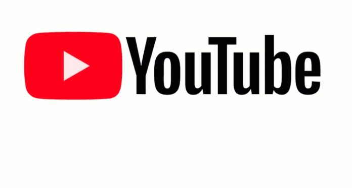
YouTube is comfortably the largest video streaming service online. However, while the platform has changed in terms of features and abilities, it has remained aesthetically similar for 12 years. The same goes for the logo, which is today getting its first major change in over a decade.
Over those 12 years, YouTube’s logo has seen the word Tube wrapped in a red box. Christopher Bettig, head of the company’s art department says the red box represents “the word tube in a tube.”
This is a nod to old TV sets that were powered by vacuum tubes. However, this technology was obsolete before YouTube launched, so its inclusion always strange. Bettig admits as much, adding “This (the Tube) is weird. No one know what this is.”
1.5 billion people watch YouTube each month and it as far removed from old tube TVs as possible. In other words, it is time for Google’s service to move on and modernize. So, starting today the brand is getting a logo overhaul that removes the tube and essentially removes the emphasis off the word.
From the press release today, there is almost a feeling that Google would like to remove ‘tube’ from the name entirely. Of course, that’s not possible as the brand is already monster recognized across the globe.
Now YouTube is pushing its own play button as the focal point of the logo. “It’s an evolution, not a revolution,” says Bettig.
New Features
While the logo is big news, YouTube has also rolled out new features as part of its fresh look. The new logo is acting as a driver for the company changing how it delivers content. Primarily, YouTube is making a shift away from a single streaming service to a collection of apps across platfroms.
This makes sense. As YouTube has grown, it has become known for many things, such as gaming, movies, fashion, and myriad other niches. Interestingly, communities have built separately around these niches, so the company feels it can affectively split them up. We have already see the seeds of this with separate services such as YouTube Kids and YouTube Gaming.
“We felt, because of all that growth, we were missing the mark. We wanted to make something more unified and cohesive, something that really reads as YouTube,” says Bettig. “We were hoping to build a visual language that would make it easy for folks to recognize it.”


